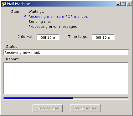
This is a very customizable bar control,
that will show a plain color bar or a gradient bar between any two colors.

:
- 30.06.2001, version 2.00.0002:
Solved a bug that made the control not handle system colors properly.
- 28.02.2001, version 2.0:
Added Caption and Orientation properties. Also changed a couple of minor
things about behaviour. Note: this version is not binary compatible
with the previous ones. Sorry. You can still find version 1.02 here.
- 09.07.1998, version 1.02:
Fixed a bug that
caused an 'overflow' error when changing the ending color for the gradient.
- 15.05.1998, version 1.01:
Fixed a bug that
made the progress bar always use black as the ending color when the
UseGradient property
was set to True.
- 01.04.1998, version 1.0 released.
:
- Align. This aligns the control to the form
in which it is placed.
- BackColor. Background color for the progress bar.
- Border. None,
Simple or 3D.
- Caption. By default,
when ShowCaption is
True, the control will show a percentage depending on
the actual value. But if you set this property to something different, the
control will show that string. Set this property to an empty string for the
control to show the percentage again.
- CaptionForeColor. If the caption with the
percent is shown, here you will be able to set in which color.
- EndColor. End color for the gradient. It
will be ignored if ShowGradient is set to
False.
- Font. If the caption with the percent is
shown, here you will be able to set what font will be used for it.
- ForeColor. If ShowGradient is set to
False, so the progress bar will be a plain color one, this color will be used. If
ShowGradient is set to
True, this property will be ignored.
- IniColor. Initial color for the gradient.
If ShowGradient is set to
False, this property will be ignored.
- Max. Maximum value that the progress bar
will take.
- Min. Minimum value that the progress bar
will take.
- Orientation. The
progress bar is able to fill up in the following orientations:
[Left to
Right], [Bottom to Top],
[Right to Left] and
[Top to Bottom].
- ShowCaption. True or
False; if set to
True, a caption with the actual percent of the progress bar will be shown.
- UseGradient. True or
False; if set to
True, instead of a plain color progress bar, a gradient will be shown, using the color
specified in IniColor and
EndColor.
- Value. Actual value for the progress bar.
Must be between Min and
Max.
:
- About. Shows the About box.
- Refresh. This will refresh the contents of
the progress bar. I have needed it when showing two progress bars, for the second one.
 |
(29 Kb) |
© Alvaro Redondo,
2001. All Rights Reserved.
http://www.sevillaonline.com/ActiveX/
![]() AR Progress Bar ActiveX Control 2.00.0002
AR Progress Bar ActiveX Control 2.00.0002